CareerFoundry Case Study
Introducing Convenient P2P Payments with PlutoPay App
I was the sole UX designer working on this case study. It took me a total of 8 weeks to complete this project, with my work including background research & development, ideation, UI design, and prototyping. The platforms I designed for included mobile and desktop. The tools I used included Draw.io for the sitemap architecture, Balsamiq for early design iterations, Adobe XD for higher-fidelity designs and Zoom for user testing.
Background
PlutoPay is a peer-to-peer financial banking app that makes paying easy. People can conveniently keep track of their finances and transact with others all in one place.
Overview
The Problem: Users need a convenient way to both send/receive payments easily and keep track of their finances.
The Solution: An app designed that makes sending and receiving payments easy, which also contains a budget feature for users to keep track of their financial habits.
The Outcome: High user confidence in sending/receiving payments using the app, as well as frequent use of additional features including group bill-splitting, invoicing, and budgeting.
The Design Process
Understanding the Problem
As the world around us changes, both with technological advancements and global concerns such as the pandemic, cash payments are becoming less common in today's society. People are finding it inconvenient (and unhygienic) to carry physical money.
Therefore, people need a way to make web-based transactions to conveniently pay other people and establishments. When they're able to confidently conduct these web-based transactions then their needs will have been met.
Checking Out the Competition
Venmo and Cash App were the two big competitors I concentrated on for the competitive analysis. They both have similar interactions such as the scannable QR codes but also contain individually unique elements such as Venmo's social feed and Cash App's stock feature.
Some features they both lacked were the ability to split group payments, attach invoices to payment requests, and track finances by connecting with a user’s cards and bank account. I kept these findings in mind during my user interviews to figure out if these features would be useful based on how people were using their p2p apps.
Connecting with P2P App Users
To obtain additional insight regarding problems users faced and what features would mitigate them, I conducted several user interviews with people who had experience using p2p apps. I found that interviewing people was a very effective way to receive feedback, as I could get some insight into how they interacted with the apps and what their pain points were.
Based on the feedback I received, these were the main insights I noted:
Everyone interviewed still used their p2p apps during the pandemic.
People mainly used their apps for small business payments and splitting bills.
Each person had some method to track their spending.
Every person stated they would prefer to have a way to keep track of their earnings and spendings within a single app.
One of the people I connected with was Brenda, a young artist in her 20's.
Survey Findings
In addition to the user interviews, I also decided to conduct a survey to get more feedback. I conducted the online survey through survey monkey and there were 23 responses to the survey questions. The results helped me decide to concentrate on useful features such as group bill splitting, invoicing, and budgeting.
Creating Personas
Hannah (the "foodie") & Ofelia (the artist)
Based on the feedback from the user interviews and survey, I decided to make two user personas: Hannah and Ofelia. I referred to these two personas throughout my design process, like during the information architecture and early wire-framing processes. Doing so helped me stay on track when ideating features that a user in their positions would need.
Mapping Out the Flows
After creating my personas, I mapped out Hannah and Ofelia's steps to figure out the most intuitive and simple flows for them. I focused on their most important goals within the product, which were determined by considering how they might interact with p2p apps given their unique activities. By creating their user journeys, I was able to ideate the best approach for the product's architecture.
Creating the Architecture
To decide on the product's information architecture, I first created a site map based on my initial competitive research and user flows. Before finalizing the app's sitemap, I decided to conduct a card sort with users.
The card sort was helpful because it allowed me to get a better idea of how users expect the layout of a p2p app to look. It also validated some of my initial decisions. Most of the main pages of the sitemap remained the same, however, certain functions were moved to different locations. For example, the 'Split Bill' feature was moved under the homepage as a part of the payment feature.
Early Designs
My first design iterations consisted of pen-and-paper sketches. I find that putting pen to paper helps me brainstorm and express my ideas more naturally. By referencing my user flows and the site map I created, I was able to design my first version of the product.
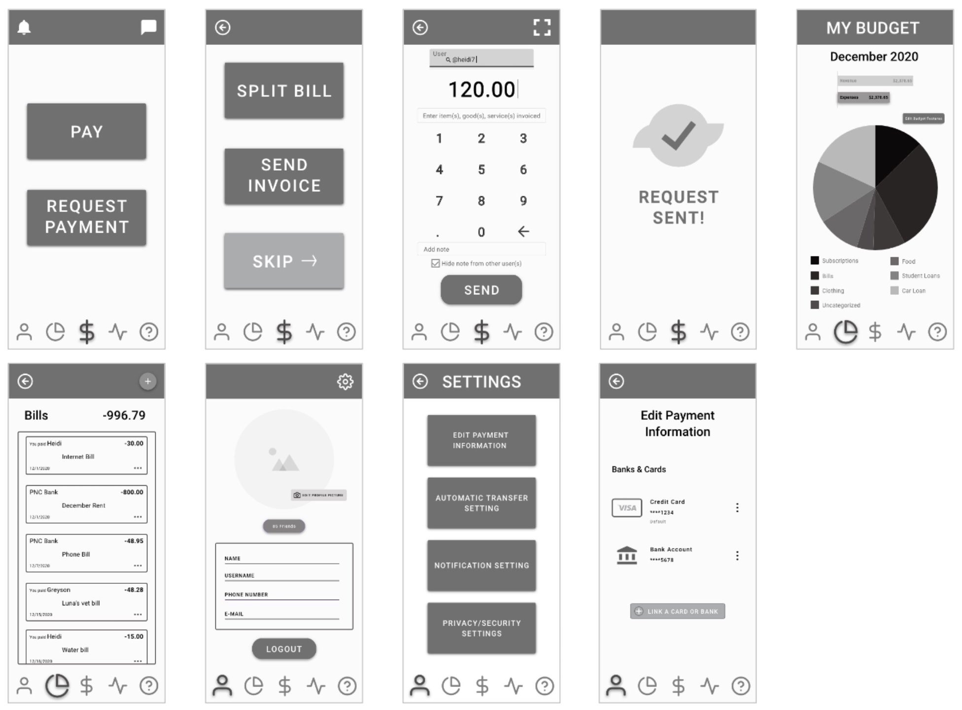
I chose some of the specific layouts shown after referencing other p2p apps, as well as some mobile budgeting apps like Mint by Intuit. These sketches helped me move forward to create my mid-fidelity wireframes, which I later used for preliminary user testing. I made slight adjustments in the mid-fidelity designs are getting a better visualization of all the components on screen.
User Testing
I conducted my first round of user testing with the goal of finding out if certain features were intuitive to use and if the icons I used were also familiar.
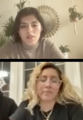
Those who participated in the testing were all familiar with p2p apps and used them often, which was my target group of users. I conducted moderated, remote testing via zoom and recorded all interviews for my own note-taking purposes with user consent.
Some of the feedback I received was that the users didn't recognize certain page icons and they didn't know whether to click within the pie chart or the legend to navigate to their categorized bills. This led me to update these features, as can be seen in the animation to the left.
This is the affinity map I created after conducting my usability interviews. This helped me focus on the most common and erroneous issues within the prototype to update.
Interface Design
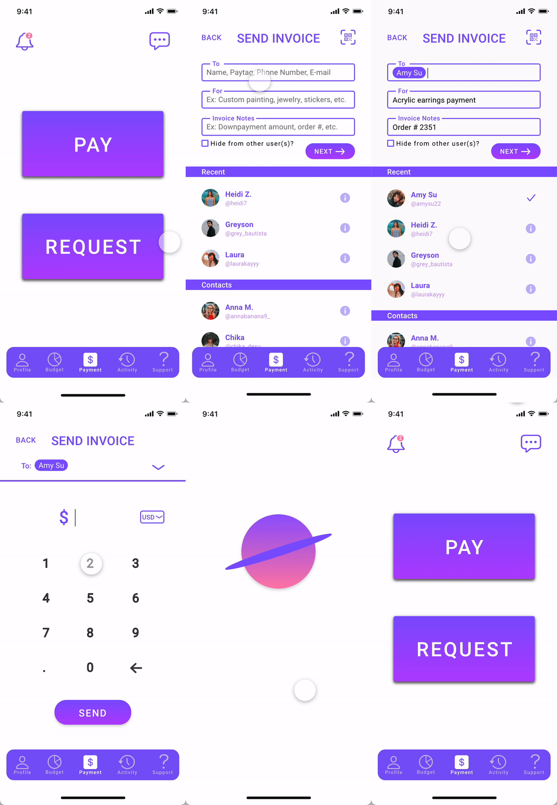
After re-testing all of the updated usability mistakes, I updated my wireframes and began designing the high-fidelity wireframes for my prototype. I decided to follow a minimalist style with bold colors, to make finances seem both simple and fun for users. I designed for iOS platforms and took a mobile first approach.
One particular element I am most proud of is the budget pie chart. I was able to animate the chart by having a slice stick out whenever a user hovers over and clicks it. My final design reflects how I was able to consider the opinions and pain points of users to successfully create a product that meets their needs.
Reiterating the Style Guide
I designed two high-fidelity iterations. The first iteration consisted of the colors and images in the style guide above. However, I concluded that those colors were too bright and bold, causing the product design to appear in-cohesive and not visually pleasing. After further researching some color theories, I decided to go back and update the product's colors and images which can be reflected in the updated style guide below. The changes show a more visually cohesive product that still meet the simple and whimsical tone.
Retrospective
PlutoPay was my first UX design project where I completed high-fidelity wireframes for MVP, and I felt like I had to do a "perfect" job right from the start. However, I learned through my process that “good” design is iterative and often requires a look back to make meaningful design updates.
One area that I struggled with the most was deciding on the product's colors. I wanted the product to feel fun because finances are often daunting and considered “boring” for most people. However, since I learned UI skills in the latter half of the program, I couldn't apply those skills in my first high-fidelity iteration. After learning the UI concepts, I decided to go back and redesign my high-fidelity wireframes to make the product more visually pleasing.


