Systems Alliance, Inc.
Introducting Multi-Selection Functionality for Acadia’s Browse Picker Screens
I was the main designer leading this project throughout Q4 2022 and to Q1 2023, with a team of 2 engineers and 1 product manager. The process for this project consisted of obtaining customer feedback from our customer success team, defining the problems, conducting secondary research, presenting to key stakeholders, and creating high-fidelity mockups for production. The tools I used to to help facilitate my designs included pen and paper, Miro, and Adobe XD.
Background
Acadia is a CMS software that allows its customers to organize, distribute, and evaluate documentation and key business information to their employees.
Historically, when our clients needed to distribute specific information or documents to their employees, they would have to make their selections individually. The browse picker select-all feature was created to make the process of selecting desired items and users more efficient.
Problem
There’s no way for our users to make multiple selections quickly within the browse picker screens.
According to our client success team, our clients wanted an easy way to make multiple selections from a browse picker listing. Users found that the current browse picker selection setup was tedious, as they had to go through and select items on a list one by one.
This was definitely a pain to deal with in instances where they might need to make tens upon hundreds of selections or more!
Two other related issue is that the number of selections made in the browse picker is not shown anywhere on the screen and the number and type of selected filters is also not shown.
Goal
Allow users to make fast multi-selections to save time and improve document flow efficiency.
Selecting multiple items one-by-one within the browse pickers is time consuming for our users. Our goal was to improve the selection speed to save our users time time and make the document/user selection process less tedious.
Solution
A multi-selection check box allowing users to make fast bulk selections.
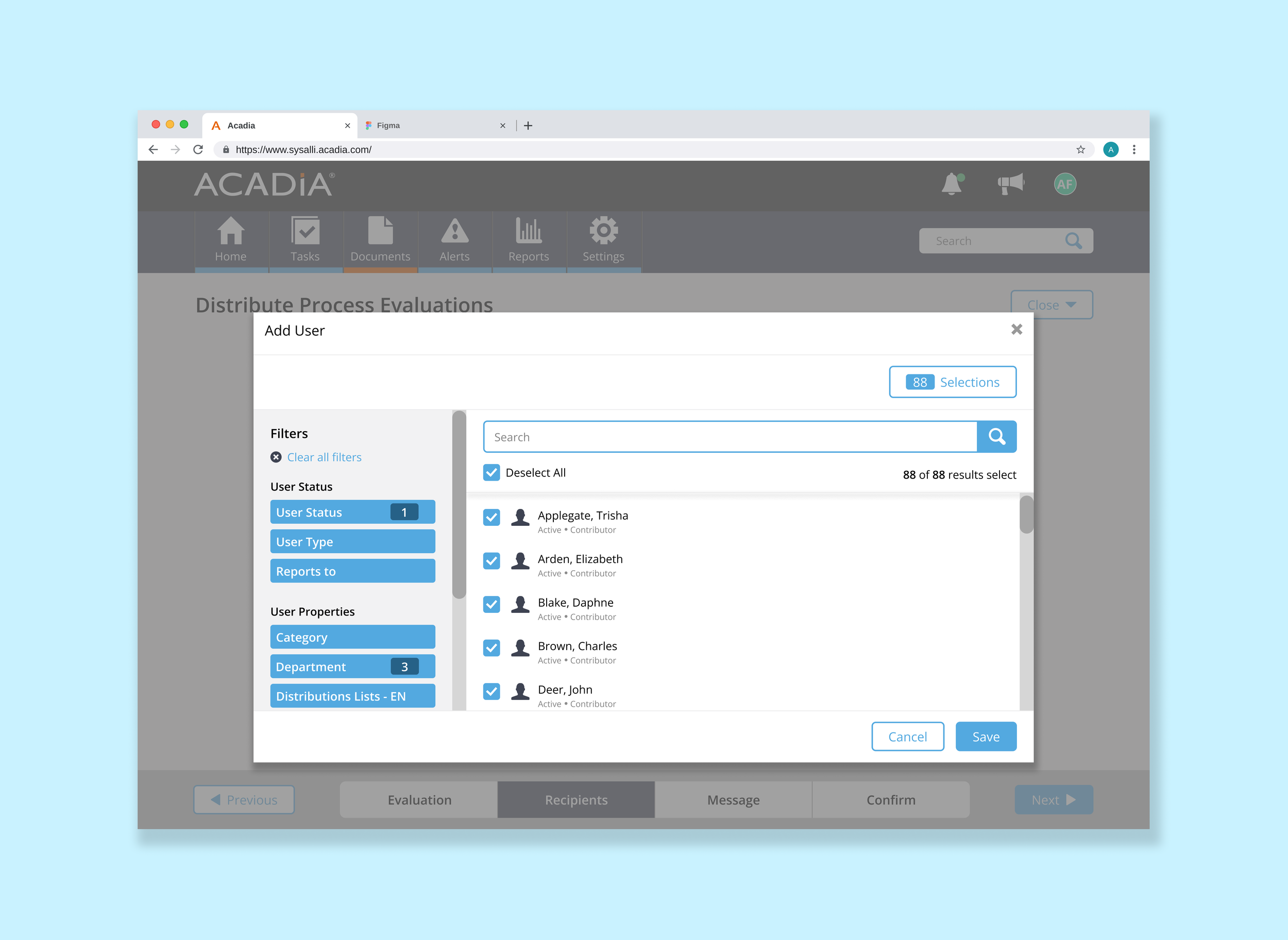
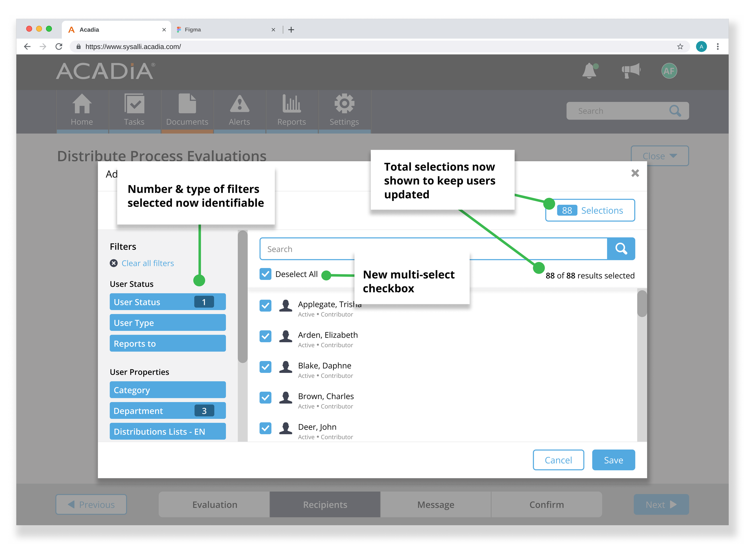
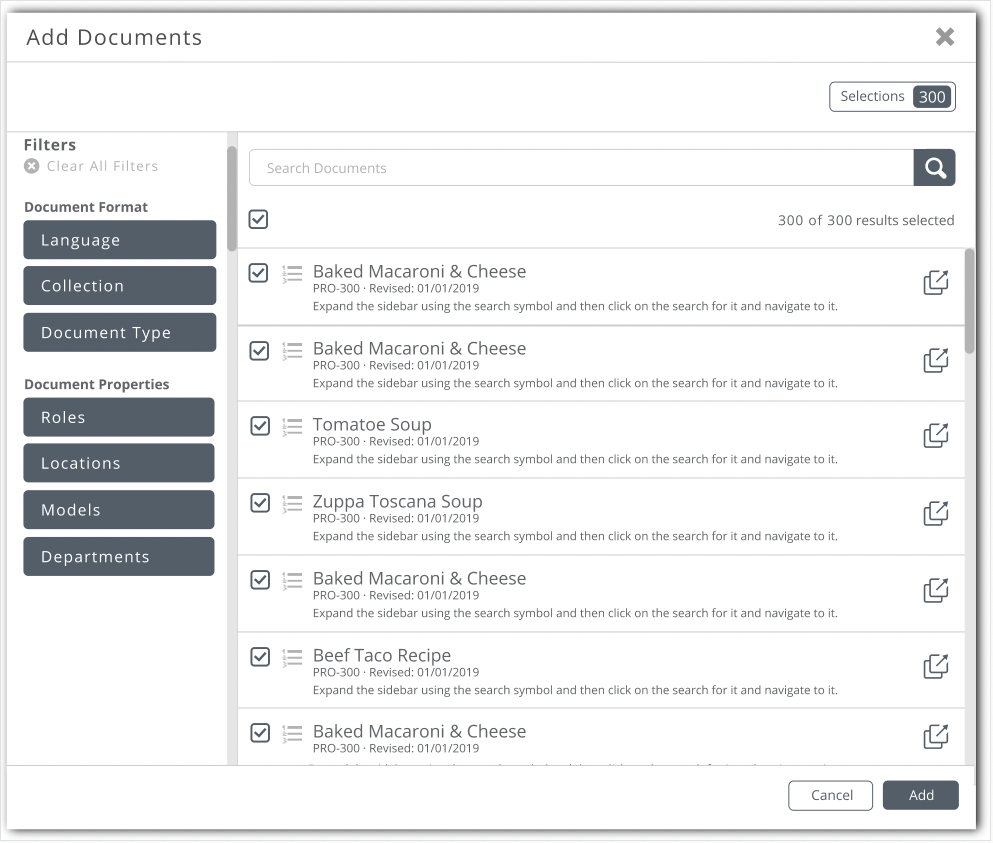
Our solution was to create a multi-select checkbox so selections can be made in aggregate when different searches and filters have been applied, and selections can be seen in comparison to the total results on a listing. This would allow users to have a quick and easy way to make multiple selections. The number and type of selected filters would also be shown to the side.
Results
Improved multi-selection speed, reducing user’s browse picker workflow by 56%.
Overall, our customers shared positive feedback about their experience with the new select-all feature, which reduced their workflow significantly. We did run into an unforeseen issue of accidental bulk selections being made, which was later addressed in a separate user story.
My Process
Discovery Session with Product Managers
Product managers shared their initials thoughts and considerations:
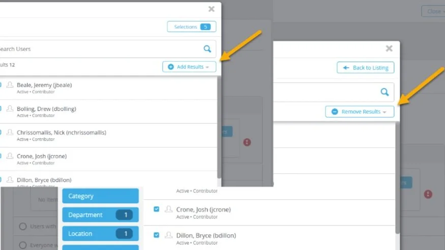
Potential Solution 1: “Add/Remove All” Button
One solution reviewed during the design team's kick-off meeting was to include an 'Add/Remove All' button to add and remove all search results in a listing.
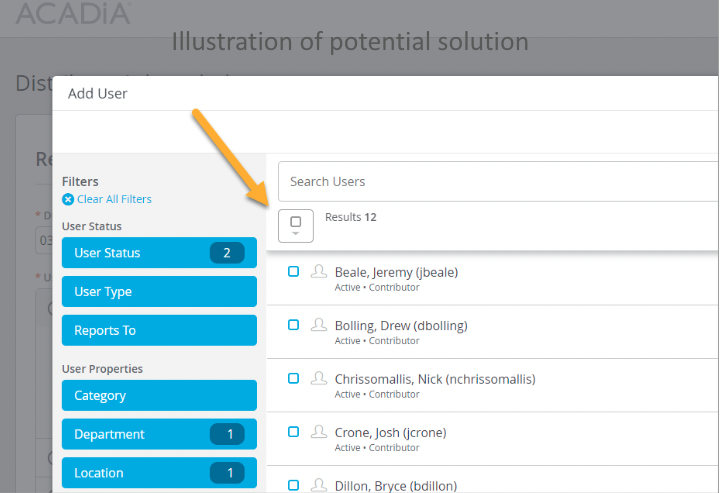
Potential Solution 2: “Add/Remove All” Checkbox
Another solution reviewed was to include a checkbox that allows user to add and remove all selections in a listing.
Additional Consideration: how do we show selections on the Multi-Picker View?
As mentioned above, users can only access the browse picker by first navigating through the multi-picker screen. Since the two sections are related, we needed to determine how the total selections made would be shown on the multi-picker screen.
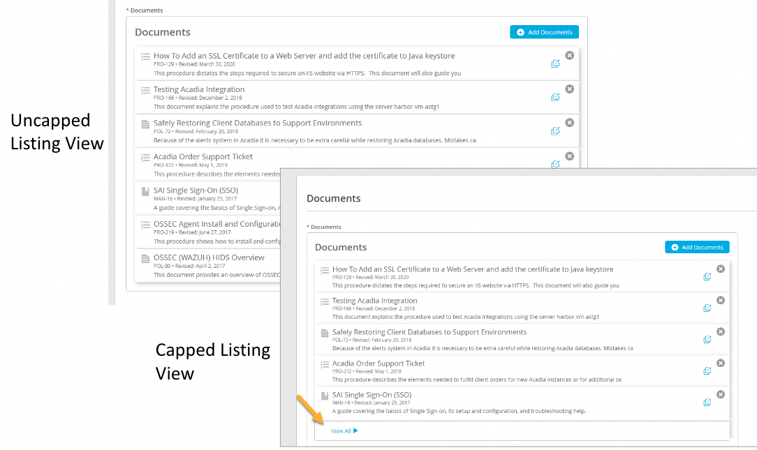
The total selections could be shown in an uncapped amount in the multi-picker view, a capped amount using a scroll bar to view more, or another capped amount by using a "view all" link at the bottom.
Some more criteria needed to be considered for the multi-select capability to prevent confusion among users.
Select all option is NOT available if a user can only select one option
Select all option is NOT available when a search exceeds a specific large number of results
Select all option is ONLY available in specific contexts (i.e. when users are selecting documents or users to send out acknowledgements, quizzes, evaluations, etc.)
Researching Potential Features & Precedents
Conducting secondary research to discover how best to show a multi-selection capability.
Research Objectives
Identifying multi-selection feature precedents.
Determine the most intuitive design approach.
Determine the best design approach for related browse picker functionalities (i.e. sticky toolbar, pagination, infinite scroll, checkbox states, etc.)
Research Outcomes
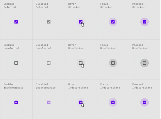
Determined relevant checkbox states.
Identified the best design solution to apply for the selection of multiple items.
Identified the most intuitive way to summarize selected items.
Determined the best listing overflow state for the multi-picker.
Research Methods
Identifying multi/bulk selection precedents.
Gathering information through relevant design articles.
Identifying visual examples of multi-selection & related components and patterns.
After confirming that checkboxes are the most necessary and basic component of multi-selection features, I researched the different states needed for our specific case.
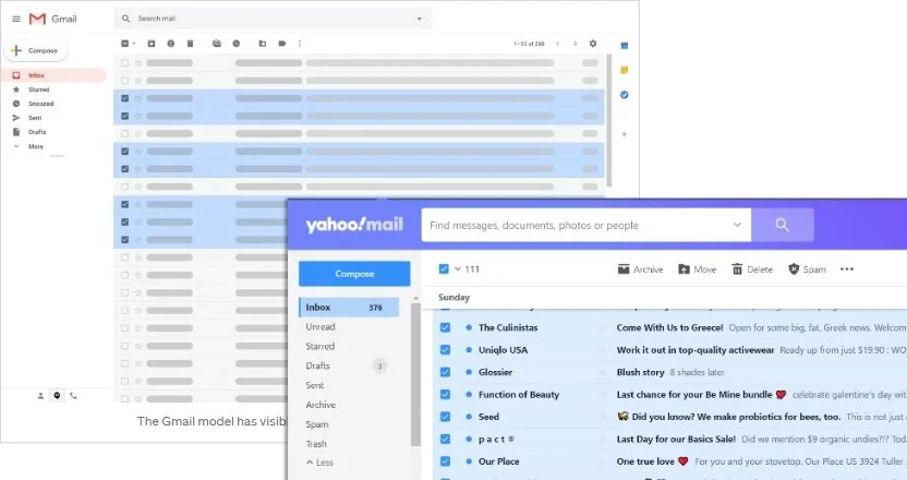
Gmail & Yahoo mail were two precedents I researched with existing select-all capabilities, identifying that a select-all checkbox is commonly used for bulk selection.
Ideating Flows & Creating Sketches
Focusing on what to update on the multi-picker view and its overflow state.
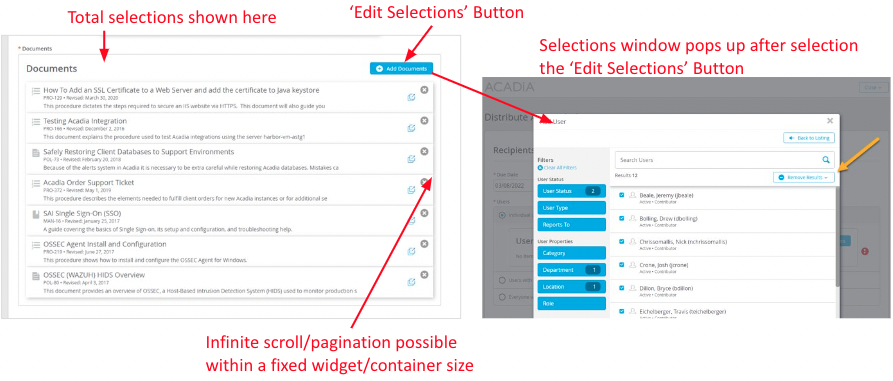
For the related multi-picker view, I had to decide which areas needed to be updated and how. Since users would navigate back to the multi-picker after making their selections in the browse picker, the "Select Document" or "Select Users" button language would have to be changed to reflect that any further changes would actually be edits to pre-existing selections. A total number of selections would also have to be shown.
For the overflow state, I found articles explaining that infinite scroll is best suited for large streams of user-generated content compared to pagination.
Proposed Changes:
For the Browse Picker
“Select All” checkbox at the top
Total results & total selections count shown
Filter type and amount selected shown
For the Multi-Picker
"Edit Selections" button included after selections are made
Total selections count shown
Scroll bar shown within fixed-height widget container to view items listed
Creating user task flows to identify areas of high interaction cost
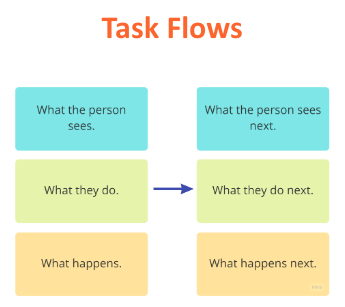
I created several task flows to help me think about how a user might interact with the new changes. I devised a new way to set up our task flows, shown on the right.
This setup breaks down high-level user stories into more granular flows and can help us identify areas where there are high interaction costs (aka lots of clicks!) so we can then look for ways to simplify the flow and make the process more efficient for our users.
Early sketches and mid-fidelity designs showcase the select-all checkbox feature and related updated elements that express to users the number of selections made.
User Feedback & Redesign
I unfortunately was unable to connect directly with our users due to time constraints. However, I closely collaborated with the customer success team to obtain user feedback during the ideation phase. The customer success team relayed that their testing efforts revealed improved speed and confidence as users interacted with the new multi-selection features. Immediate value was noted from these improvements, which led the product team to move forward with the final designs.
Click the prototype below to see the design changes applied and the multi-selection capability with the different checkbox states applied.
Unforeseen Issues Arise
Customers shared positive feedback about their experience with the new multi-selection feature, finding immediate value. However, this new feature improvement also introduced an some unforeseen issues...
Users were not double-checking their selections and were accidentally including sending out mass amounts of document and user selections. So even though the multi-selection feature made things faster, it also increased potential for human error.
The team acted quickly and introduced a separate pop-up solution to make users slow down and confirm selections of over 50 items.
This was to ensure that they were not accidentally sending mass amounts of selections to other users. After the inclusion of this confirmation window, our users felt more confidence in sending out their selections to other users on their team.

