Emotewell
Emotewell Redesign for Improved User Satisfaction & Retention
I was one of two UX designers working on the Emotewell site redesign. It took us a total of 4 months to complete this redesign, with our work including user research, user interviewing, ,creating moodboards, and wireframing.
The tools I used included FigJam for the creation of user personas and for creating an affinity map of user feedback; Figma for showcasing the high-fidelity wireframes, moodboard and assets; and Zoom for collaborating cross-country with my fellow designer, product manager and Emotewell’s CEO.
Background
Emotewell is an online journaling site that helps its users develop journaling habits for improved mental wellbeing.
Its digital form makes it more convenient compared to traditional journaling on pen and paper, and its pre-created journaling prompts can help users more easily define their complex emotions.
The goal for Emotewell’s redesign was to improve the site user flow and introduce UI changes that would entice current users to routinely use the application and new users to begin using the digital journal feature.
Increasing the number of Emotewell’s users after the redesign also led to increased investor acquisition.
The problem is that no one is routinely using their online journal!
Emotewell’s CEO shared feedback collected from current users, of which many said that they were not routinely using with their digital journals due to:
confusing site flow/setup
unappealing design
Users found the original site design “bland” and “unappealing”, which seemed to keep them from routinely journaling.
Improved flow & visuals can lead to improved customer satisfaction & retention
We want Emotewell’s current users to feel enticed to routinely user their online journal, and we also want to entice new customers to join! Based on the user feedback, our design attack plan included:
Prioritizing user pain points to introduce user flow improvements supported by research of similar journaling/mental wellness products.
Applying cohesive, “fun” interface design by capturing the product’s brand identity in a moodboard.
Analyzing User Feedback and Common Struggles to Determine the Main Pain Points
I gathered feedback from Emotewell’s current users on their impressions of the app, as well as their struggles to determine what types of features would be most useful for them going forward based on their behaviors, routines, and current habits. I organized the feedback in FigJam using affinity mapping, where the team and I worked to create groupings and defined these groups based on similar themes.
Affinity mapping allowed us to discover specific pain points and struggles shared among several users which we then prioritized based on user impact.
Researching the Competition: What Makes Them So Popular?
A competitive analysis was conducted during our research phase to help guide our later design decisions during ideation. I conducted an analysis of two mindfulness-focused apps: Calm and Jour (since acquired by Alan in 2021).
These two apps are centered around providing their users with the right tools to develop mindful habits and diminish their stress.
Calm offers videos and music to help their users meditate, sleep better, and incorporate more movement in their daily life, while Jour is an online journaling app, similar to Emotewell.
Jour (now Alan)
Calm
From our analysis we discovered some of the key design features that have made these apps successful in gaining and retaining their users:
Using appealing and calming colors in their UI design
Having a variety of inter-connected features that makes interacting with the app enjoyable for users (music, mood tracker, journal overview/calendar, etc.)
Based on our analysis, we considered introducing new features related to the app’s pre-existing journaling capability, such as a journal entry calendar/tracker, in addition to improving the UI for a more appealing design. We expected these changes to improve overall customer retention and acquisition.
Creating Moodboards to Solidify Emotewell’s Brand
I collaborated in creating several moodboards to best capture the mood and brand of Emotewell as a journaling app. Finalizing Emotewell’s brand would allow us to create more cohesive UI designs later on.
After interviewing some users and analyzing the design of competitors, we determined several aspects that we wanted to capture as the feeling of Emotewell in our redesign.
Emotewell’s Desired Tone: Safety, Calm, Gentle.
First few moodboard iterations:
After several iterations, we finally landed on our final moodboard. This version was selected due to the calming colors of the cool hues and the cloudy, liminal skyscape portraying a sense of safety and privacy - which were descriptions we felt were necessary for an online wellness journal.
Creating Mid-Fidelity Designs & Conducting User Testing to Validate User Flow
I worked on some early wireframes to use for user testing. Based on the feedback we received, updates would be made to then finalize our high fidelity designs.
Though many of our users expressed positive feedback on the updated colors and icons in our mid-fidelity designs, they were confused about the image placeholders during testing. They also expressed that the lack of images made the interface feel “flat” and “boring”.
This feedback further supported our initial thoughts that including fun and inviting images and icons would make the product feel more enticing to use for our customers.
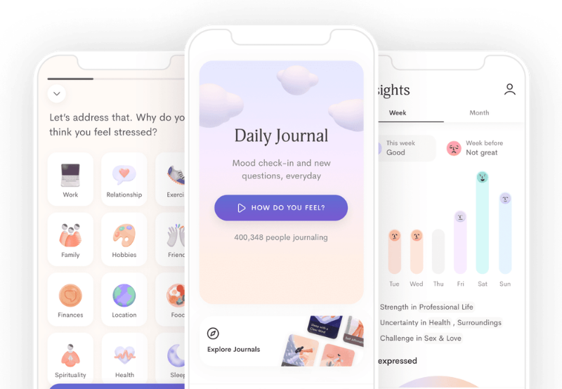
Final Designs: Creating the High-Fidelity Designs and Assets for Hand-off to Developers
I created the high-fidelity designs using the mid-fidelity wireframes as a foundation with some slight changes to the layout. These changes were made mainly to allow for more space in between the images included and to create clearer groupings among the information showcased.
Unfortunately, we were unable to test the high-fidelity designs due to time constraints, as our contract period was ending and I had recently accepted a full-time position elsewhere.
If we had a longer opportunity to work with Emotewell, I would have enjoyed conducting some A/B testing to test the effectiveness of some of the CTA versions.
I also made sure to organize the high-fidelity designs with notes and organize the assets within Figma for the engineering team to reference when coding for the changes.


